NawNaw
It isn't really an app about essentials. It's an app about time, and about handing a little of it back.
The problem belongs to the customer
It’s 6:40 in the morning. Tunde has the most important meeting of his quarter at 8, the one he’s been preparing two weeks for. He’s showered, half dressed, reaching for the one thing that finishes the outfit, and there isn’t a clean pair of socks in the drawer. The tie he meant to wear went home with a cousin weeks ago. The shops near him won’t open for another three hours, and next-day delivery is no use to a man who needs it in twenty minutes.
He opens an app, taps twice, and pays. Fourteen minutes later a rider hands him socks and a tie at his gate. He leaves the house on time.
Or is it Amina? A mother of two, with breakfast to make before the school run, who reaches into the fridge for eggs and milk and finds both finished. The shop down the road is open, but “down the road” means getting two children dressed, into the car, through traffic, and back, and there simply isn’t time. She doesn’t need the store to be closed to be stuck. She just needs the twenty minutes she doesn’t have.
Two different mornings, one need. Sometimes the world isn’t open yet. Sometimes it’s open and you still can’t get there, because the thing you’re short of is time, not access. NawNaw is built for both. It isn’t really an app about essentials. It’s an app about time, and about handing a little of it back.
The name was the brief
Before NawNaw was an app, it was a promise hiding in a word. In Nigerian Pidgin, nawnaw means right now, immediately, this second. “Make we do am nawnaw” is “let’s do it immediately, no waiting.” It’s a word people already say a dozen times a day without thinking, warm and local and impatient in exactly the right way.
So the name does the first piece of design work before the app even opens. It says fast in a language the customer already speaks, and it sets the bar the whole product has to clear. From the first screen onward, the name became my filter. Every feature, every extra tap, every clever idea had to answer one question:
Does this make NawNaw feel nawnaw?
If a screen slowed you down, it was failing its own name. That single test killed more features than it kept, and most of the decisions in this case study are really just that question, asked in different places.
Who I was building for
NawNaw is built for Nigeria’s Tier-1, tech-comfortable city dweller, the person who already pays for convenience without thinking about it: who rides Bolt instead of haggling a taxi, who orders dinner on Chowdeck, who values an extra twenty minutes more than a saved few hundred naira.
Within that, there’s a spread. The youngest earners (call them the impulse crowd) order often, small, and on a whim. Slightly older professionals order in fuller, more planned baskets. Busy parents do urgent top-ups. They differ in rhythm, but they share the same instinct: time and convenience first, price second.
One insight from the customer work shaped the entire interface more than any other. For the youngest, most frequent shoppers, the large majority of orders are unplanned. They don’t open the app with a list. They open it because they remembered they’re out of something, or because something caught their eye. That changes the job of the app completely. A planned shopper wants a search box and a fast checkout. An impulse shopper wants the app to surface a want, to remind them of the thing they didn’t know they’d buy. NawNaw had to do both at once: help the person who knows exactly what they came for, and gently tempt the one who doesn’t.
The part nobody sees: making fifteen minutes pay
A fourteen-minute delivery feels like magic to the person at the gate. Behind it is a warehouse, a rider, and a margin thin enough to be where most quick-commerce dreams quietly die. This is the section where I worked out whether the magic could actually fund itself, and it’s the part I’m proudest of, because it’s where the business and the design stopped being two separate conversations.
Why the affluent customer, honestly.
The instinct is to chase the biggest possible market, but the economics of this model in Nigeria push hard the other way. India built quick commerce first and at enormous scale, so it’s the closest mature mirror of where Nigeria is heading, and I used it as my reference throughout. But you can’t simply copy India’s numbers, because the two economies pull in opposite directions. In Nigeria’s big cities, rent and power (you are often running a generator) and general overhead run higher than in comparable Indian cities, while the average shopper’s spending power runs lower. Higher cost to operate, lower income to sell into.
That squeeze has a practical consequence. For much of the mass market, average baskets are unlikely to be large enough to comfortably support fifteen-minute delivery economics. The customers most able to sustain the model are the ones already paying for convenience elsewhere. So the choice to serve them isn’t taste, it’s arithmetic, and it quietly decided everything downstream.
The one number the whole store balances on.
Quick commerce lives or dies on the size of the average order. Rather than guess at a target, I worked it from both ends: what a Nigerian customer in this segment can comfortably spend in one go, and what an order has to be worth for a store to break even. The two met in a clear ladder:
- The floor an order can’t fall below: ₦6,000.
- The target to design toward: ₦10,000.
- A healthy, mature basket: ₦12,500+.
Why the delivery fee stops being a mystery.
Once riders are a per-trip cost, delivery becomes a variable expense rather than a fixed one. Orders that pay the ₦600 delivery fee largely cover the rider commission, while free-delivery orders are subsidised by product margins. The store’s economics therefore depend primarily on basket size, gross margin, and keeping enough order density within a small delivery radius.
So how busy does a store need to be?
Divide the monthly cost by what each order contributes and the answer is roughly 90 orders a day to break even. Whether that volume is comfortably achievable depends on neighbourhood density, rider availability, and customer adoption, but it sits within the range quick-commerce operators target once a store matures.
The metric I actually designed toward.
The easy way to lift the average order is to discourage small ones, but small frequent orders are exactly the habit that keeps a customer coming back. Chase a bigger basket too hard and you can win the order while losing the customer. So the real goal was never “biggest basket.” It was the total a customer is worth over a month: their order size and how often they come back, together. That single reframe is why the app nudges baskets upward gently instead of bullying them.
Six ideas the whole app is built on
1. Sell time and convenience, not price.
The customer is paying for speed. Lead with it everywhere, and never train them to shop on discounts the business can’t afford.
2. Surface the want; don’t make people hunt.
Most orders are unplanned, so the app’s job is to show, suggest, and remind, not to hand someone an empty search box.
3. Never make speed wait on a form.
Asking who someone is should never stand between them and the thing they came to buy.
4. Let people shape their own shop.
One catalog, but everyone should be able to make it feel like theirs.
5. Do the maths so the customer doesn’t have to.
Pricing should help you build a better basket without ever feeling like arithmetic.
6. The wait is part of the product.
Fifteen minutes of waiting is still fifteen minutes of the experience. Design it.
The journey
The home screen is a store you can read in a glance
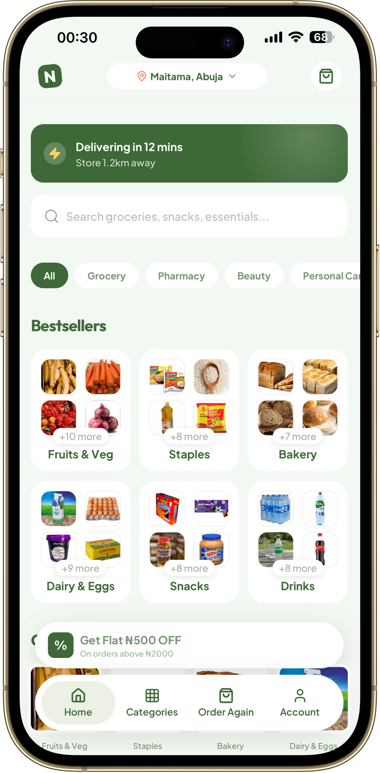
An essentials catalog is a wall of hundreds of products. Drop that wall on someone in a hurry and you’ve lost them before they’ve started; they came for milk and bread, not to scroll a supermarket. So the home screen doesn’t show products at all. It shows aisles, and each aisle shows just four things through a small window: a 2×2 peek of what’s inside. It’s enough to recognise “yes, that’s where the milk lives,” and never enough to drown you. You take in the shape of the whole store in one glance and tap straight to what you want. (Surface the want; don’t make people hunt.)
The very top of that screen is where NawNaw makes its promise out loud. Instead of a discount banner, it leads with the thing the customer is actually here for: how fast, and how close. “Delivering in 12 minutes. Store 1.2km away.” A bargain app shouts about price. NawNaw shows you time, because that’s what you’re paying for, and because the moment you teach this customer to hunt for discounts, you’ve started a fight the economics can’t win. (Sell time and convenience, not price.)
Letting you hide what you’d rather not see
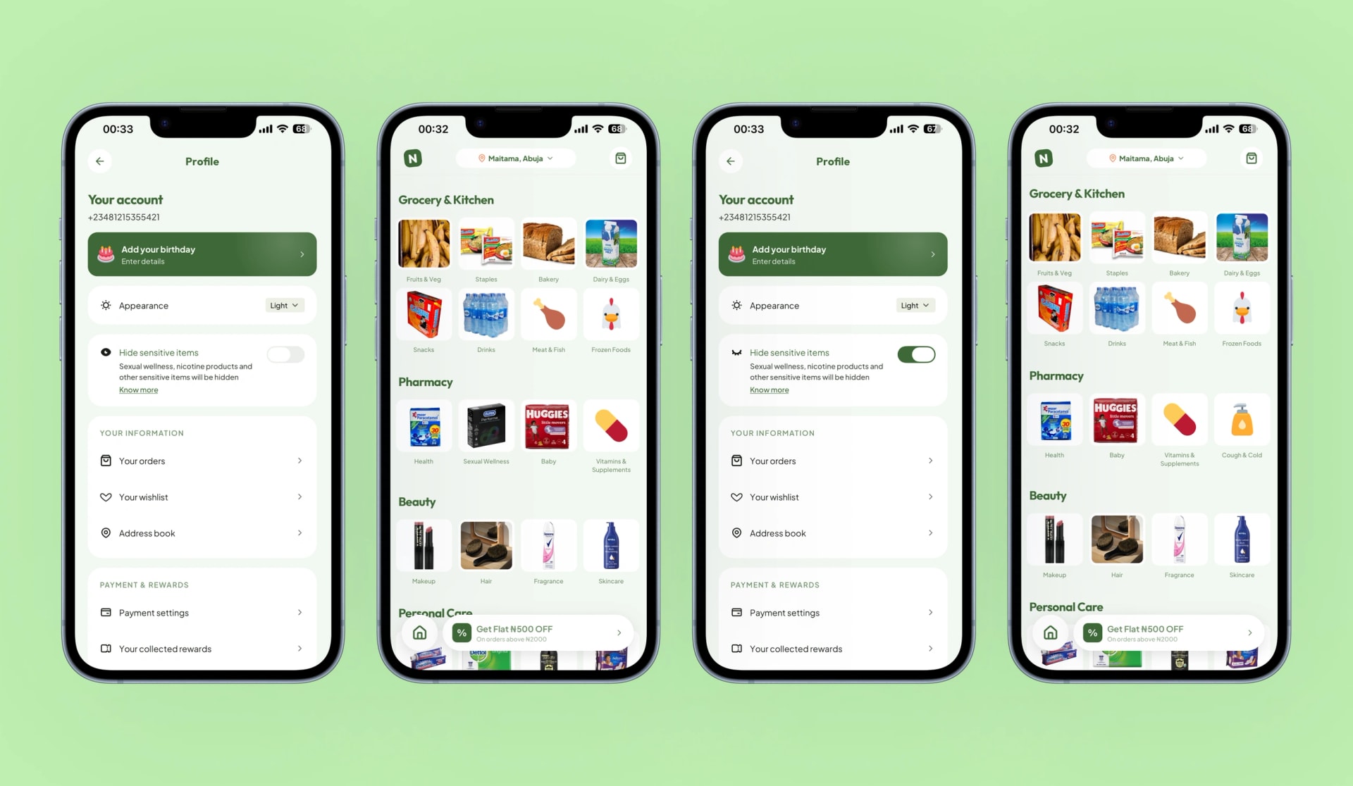
Not everyone wants the same shop. A category like sexual wellness (condoms, lubes, nicotine and vapes) is an everyday essential for some people and something others would simply rather not scroll past: at the table, with a child looking over a shoulder, or just because it isn’t part of their life. Most apps treat the catalog as fixed and make everyone live with the same shelves. NawNaw doesn’t.
On the profile screen there’s a simple toggle. Flip it, and those categories quietly leave your store. It isn’t censorship and it isn’t a judgment; the items are always one switch away the moment you need them. It’s just an acknowledgment that a person’s shop should feel like theirs. (Let people shape their own shop.)
A cart that does the maths so you don’t have to
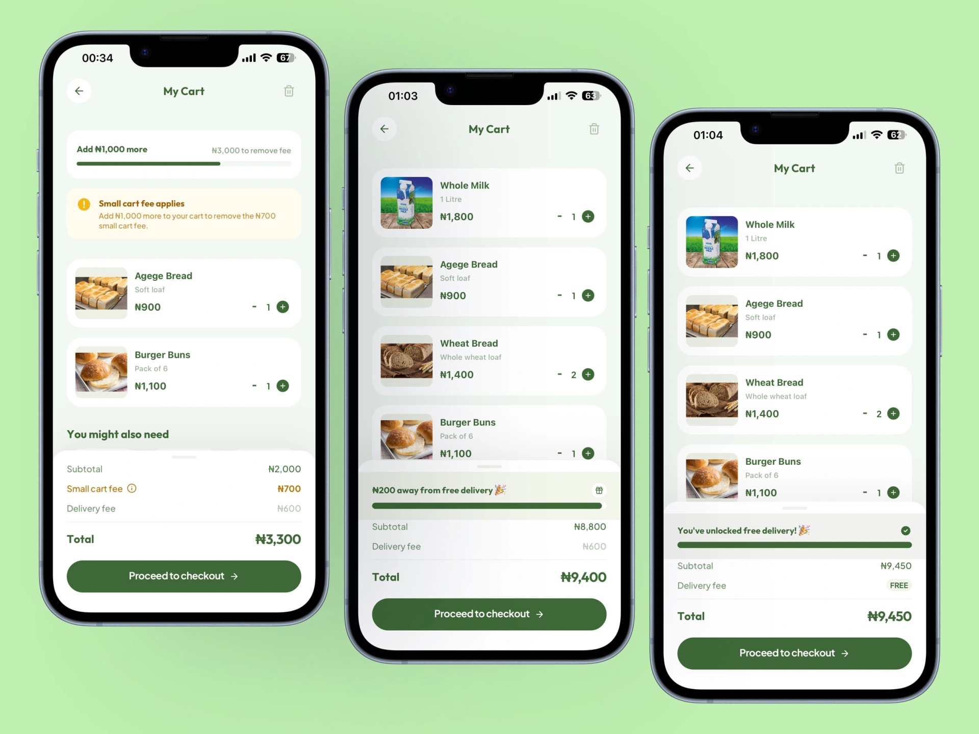
The cart is where all that earlier economics turns into something you can feel, and it does it without ever showing you a number you didn’t ask for.
A very small order genuinely costs more to deliver than it’s worth. Rather than spring a charge on you at the end, the cart speaks up early and helpfully: “Add ₦400 more to skip the small-cart fee.” It frames the fee as something you can avoid, not a punishment, because “remove this” is a far better feeling than “pay this.” Keep adding and a slim progress bar fills toward free delivery, with the exact amount left to go, turning “spend more” into a small, winnable game: “You’re ₦600 away from free delivery.”
Offering an account, never forcing one
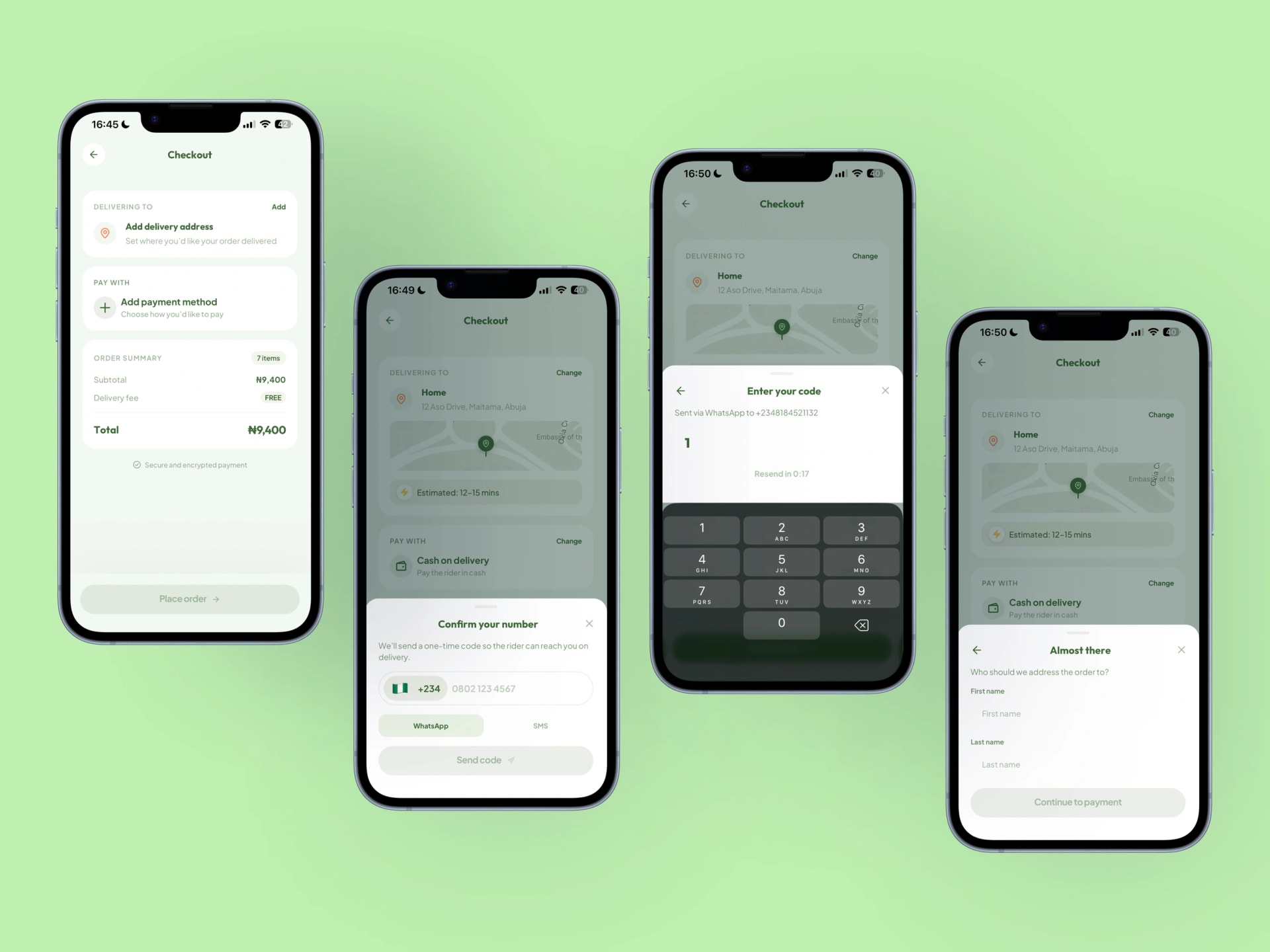
NawNaw offers you an account the moment you arrive: a quick sign-up or log-in, and that’s where it learns your name. But it’s the easiest screen in the app to walk straight past. Tap “Skip” and you’re inside the store as a guest, browsing and filling a basket with no account at all.
For a guest, the app then waits until the one moment identity genuinely matters: placing the order. Only then does it ask, and only for the bare minimum a delivery needs: your phone number, a quick code to confirm it, your name, and where to deliver. No email, no password, no profile to build. It slides up as a sheet over the checkout rather than throwing you out to a separate screen, so the moment you confirm, the order is already on its way and you never lost your place.
Payment then meets people where they actually are. Card, yes, but also bank transfer, USSD for when the network is thin, and cash on delivery, because Nigerian payment habits were never card-first.
Telling us where you are, the way Nigerians actually give directions
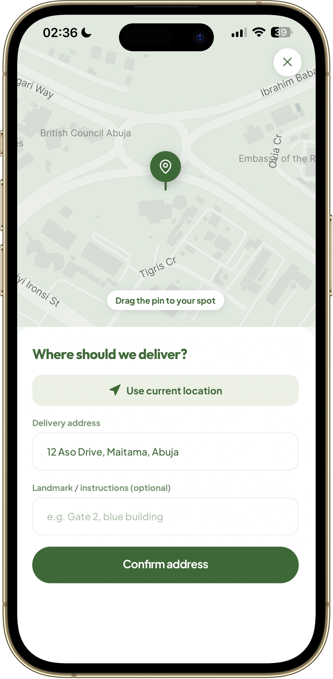
A fifteen-minute promise only holds inside a small radius around a store, so the app has to be sure of where you are. It shows a map with a pin you can drag, which is the familiar, reassuring way to point at “here.” But the thing that actually gets a rider to your door isn’t a dot on a map, it’s the written address and, crucially, the landmark, because that is how people in Lagos and Abuja genuinely give directions: not by coordinates, but by “the blue gate after the second junction.” So the typed address and landmark are treated as the real instructions, with the map doing the work of making you feel confident you’ll be found.
The wait is part of the product
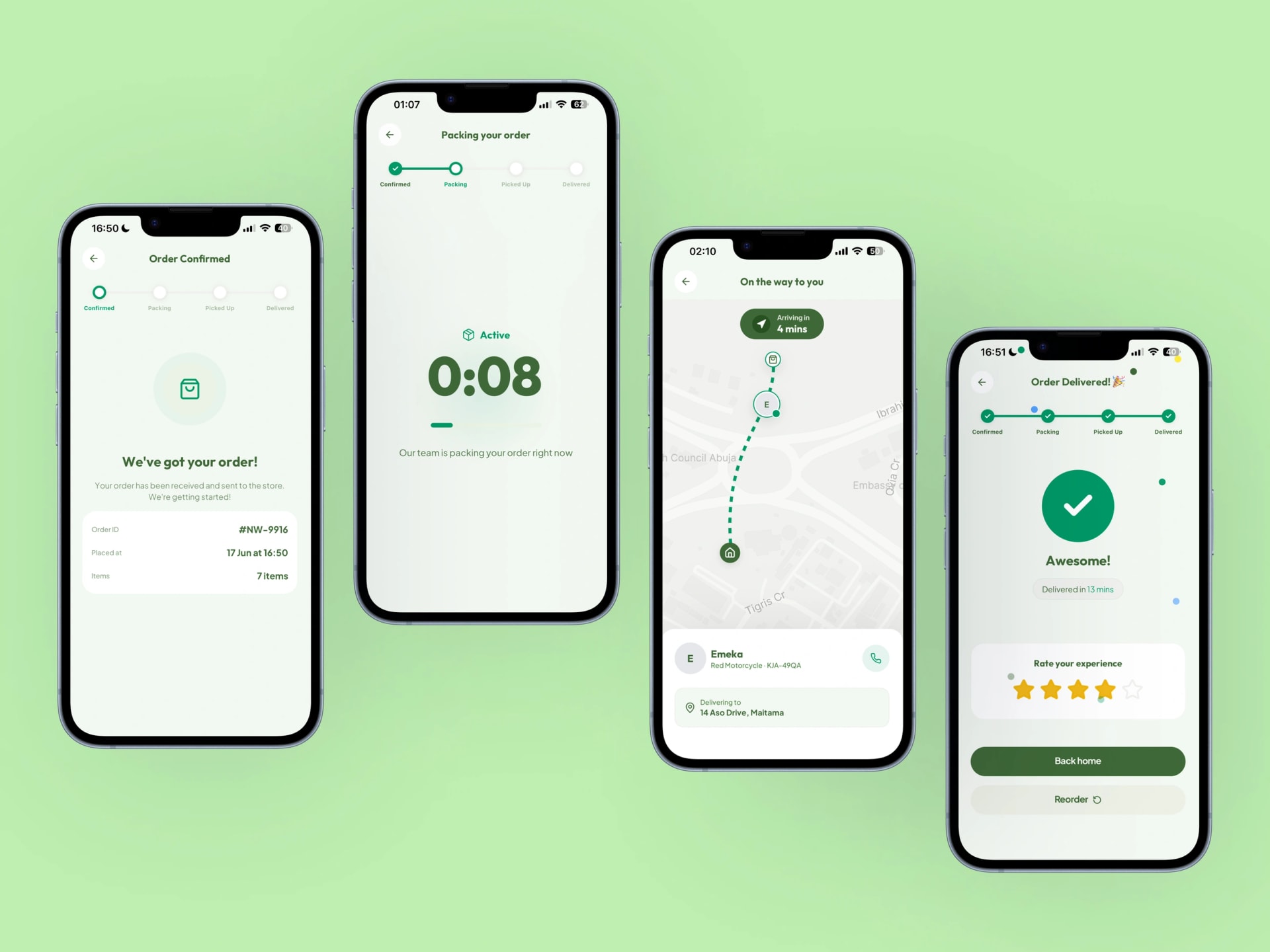
The fifteen minutes between tapping pay and opening your door is not dead time to hide behind a spinner. It’s the part of the experience where the promise either feels kept or doesn’t.
So NawNaw shows the order moving through real stages, accepted, being packed, on the way, rather than an anonymous loading wheel, and it puts a live countdown on the screen. That countdown is the brand’s whole claim made visible and accountable: you watched it say fifteen minutes, and now you can watch it mean it.
The product page, for when you actually want to look
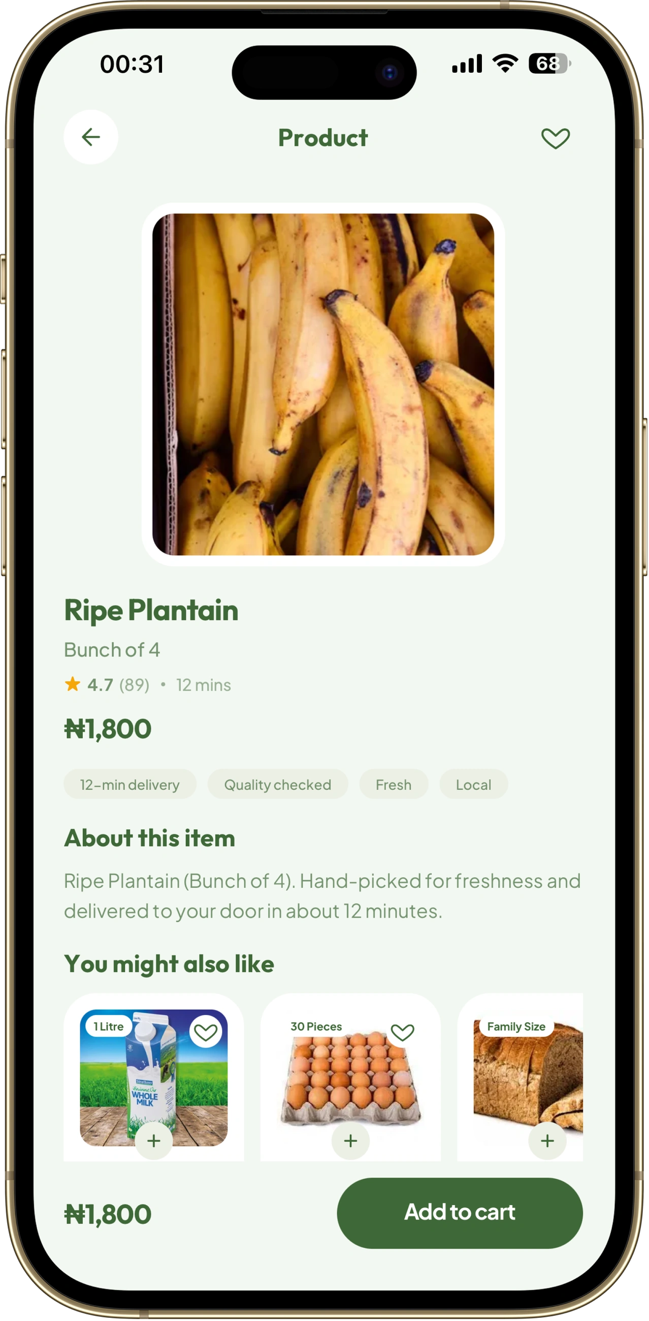
Not every purchase is a grab-and-go. Sometimes you do want to look closer, compare, decide. The product page is built for those moments: a clear image, the price, an obvious way to add, and the reassurance people instinctively look for before buying something new. It’s the calmer end of the app, the counterpart to the quick aisle preview, there for the considered purchase without ever getting in the way of the impulse one.
Where I’d take NawNaw next
NawNaw today is the customer’s half of the story, designed and built end to end. The natural next chapter is the half the customer never sees: the engine inside the warehouse that makes a fifteen-minute promise physically possible, the pick-and-pack and dispatch tooling that turns a placed order into a rider at a gate. That operational layer is where the real competitive moat lives, and it’s the piece I’m most excited to design next, because it’s the same puzzle as the app, fewest steps, fewest mistakes, every second handed back, just pointed at the people on the inside.
Beyond that, the app earns its richness with use: smarter suggestions as it learns your staples, membership for the customers who order often enough that delivery should just feel free, and deeper personalisation built on the same belief the sensitive-items toggle started with, that the shop should bend to the shopper.
What building it taught me
The lesson I keep coming back to is how early the most important decision was made, and how far down it reached. The choice of who to serve wasn’t a branding exercise; it fell straight out of the economics, out of one stubborn fact about cost and income. And from that single decision, everything else followed: sell speed and convenience instead of price, design for the unplanned want, build a cart that nudges instead of nickels, name the whole thing after the one promise that matters.
NawNaw is currently a deeply researched concept as it is capital intensive, and why this case study is about the thinking rather than a chart of results. But the thing I’d want anyone reading this to take away is the one claim I’ll stand behind without a single metric:
Nothing on the screen is there by accident. Every decision traces back to a real person who was simply out of time, and to what it honestly takes to give some of it back.
Key assumptions (Appendix)
Because NawNaw never operated, the economics in this piece come from a working model rather than live data. I built them by benchmarking India’s quick-commerce market and then localising for Nigerian costs and incomes.
- Target average order value (AOV): ₦10,000 (floor ₦6,000, stretch ₦12,500+).
- Gross margin on goods: 20%, blended across categories.
- Delivery fee charged to the customer: ₦600, waived above the free-delivery threshold.
- Share of orders that reach free delivery: ~60%.
- Rider commission per trip: ~₦500 for a short, within-3km delivery. Riders are paid per trip, not salaried.
- Monthly fixed cost per dark store: ~₦4.2M (Rent ₦2M, Staff ₦1M, Power/Diesel ₦0.7M, Misc ₦0.5M)
- Break-even: ~90 orders a day (about 2,700 a month).
*A working version of this model, with every input adjustable, sits behind these figures.